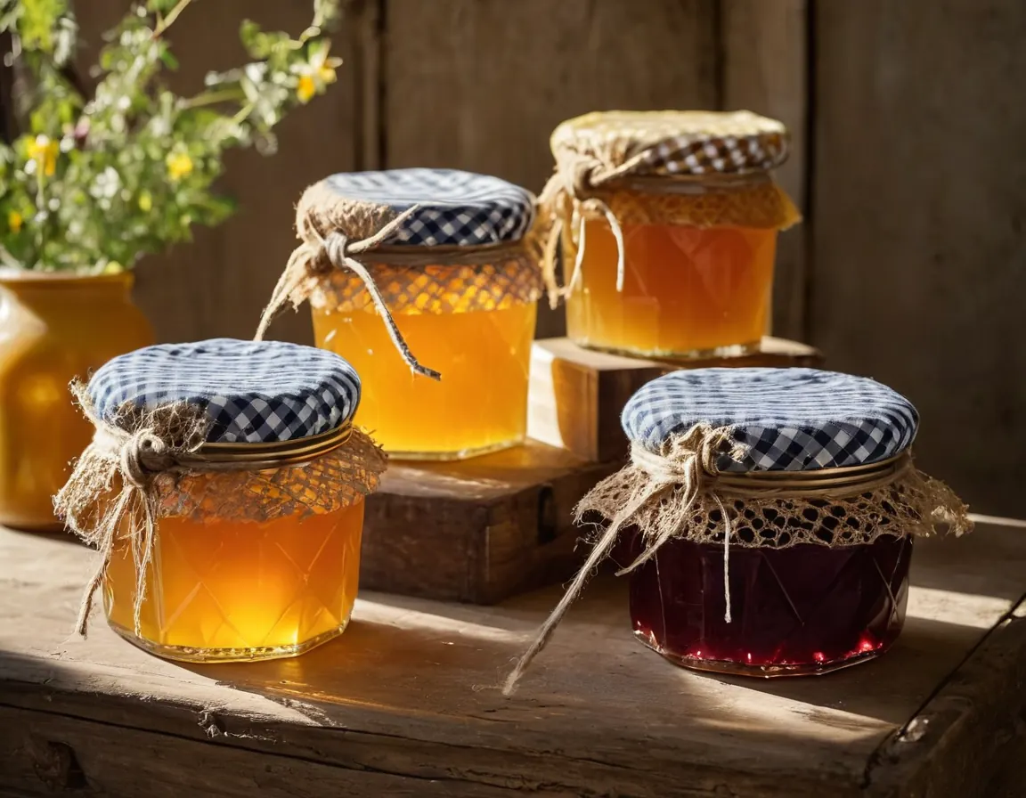
Rebrand for a regional food producer
Sample case study. Shows how to present a rebrand: the situation, what was made and the results you can prove.
A logo, colours, type and a small set of rules that make everything you publish look like it came from the same place.
A visual identity is the logo plus everything around it: the colours, the typefaces, how photos are cropped, how a slide or a social post is laid out. Getting these right means your team can make new material quickly without it drifting off brand.
We start from the brand strategy, not from a mood board. We show two or three distinct routes as real examples (a website header, a proposal cover, a social post) rather than a logo on a white page, so you can judge how each will work day to day. You choose one, and we refine it with two rounds of changes.
Files come in every format you are likely to need: print, web, social and office templates. Typefaces are licensed in your name.
Process
Two or three design directions shown in real use.
The chosen route developed, with two rounds of changes.
Final files, guidelines and templates handed over.
Case studies
Sample case study. Shows how to present a rebrand: the situation, what was made and the results you can prove.
Two rounds of changes at each stage. More can be added if you need them, at a rate agreed in the proposal.
Start a project
Tell us what you need and when you need it. A short message is enough to start.
The online form isn't set up yet. Email or call us and we'll take it from there.
We reply to every enquiry within one business day.